Figure 1. Distribution of disease subgroups among the study cohort. The pie chart illustrates the proportion of patients in each disease
subgroup, expressed as percentages of the total cohort (n = 34). Subgroups were defined according to clinical presentation
and molecular findings.
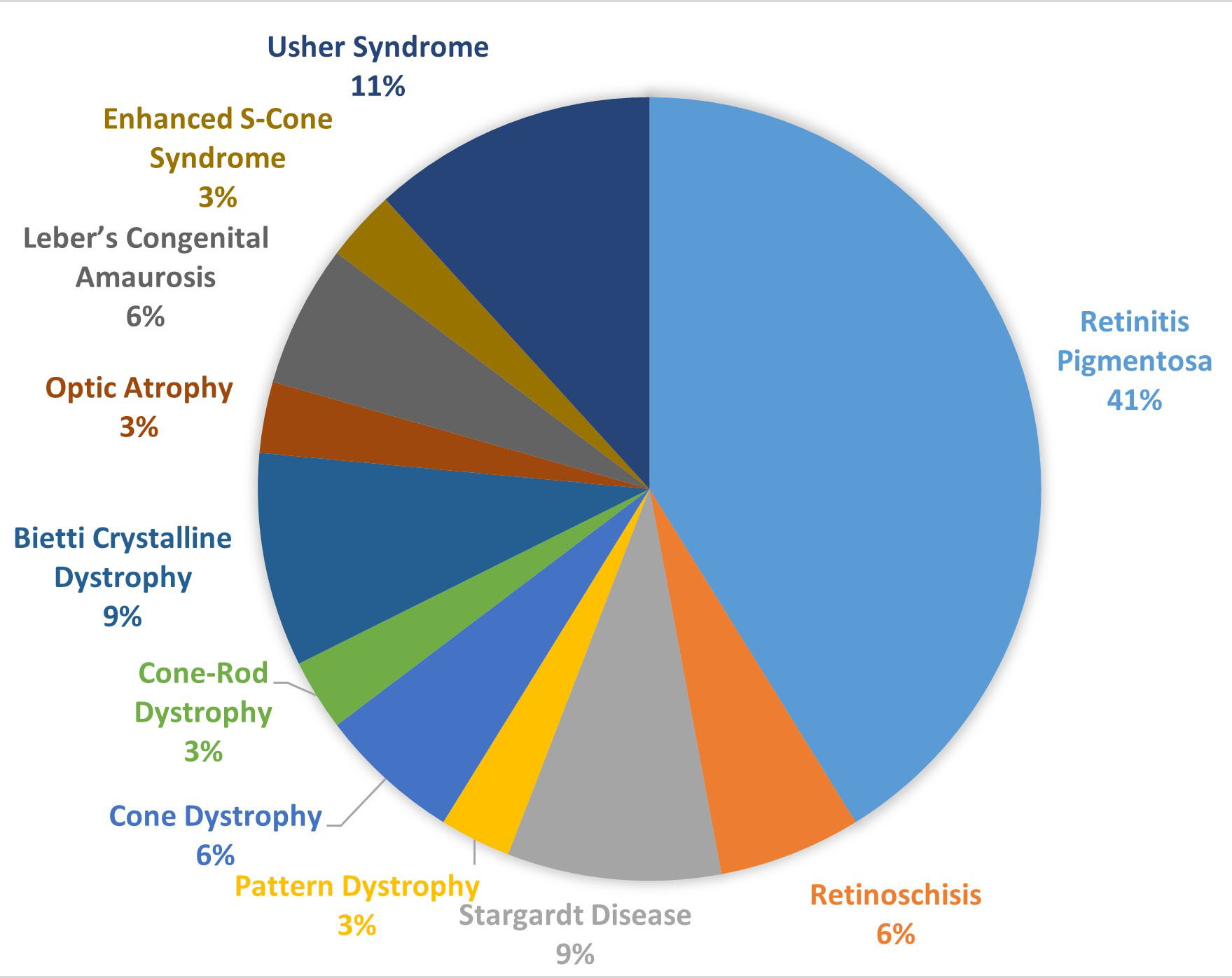
 Figure 1 of
Keles, Mol Vis 2025; 31:502-513.
Figure 1 of
Keles, Mol Vis 2025; 31:502-513.