Figure 5. Global splicing events. A: The average percent spliced in (PSI) value across all cells is plotted for each alternative splicing
event detected in more than ten cells and the distribution represented as a violin plot. This shows that the majority of events
are either present or absent in most transcripts. B: A t-distributed stochastic neighbor embedding (t-SNE) plot based on PSI values does not reveal any distinct cell clusters.
C: A heatmap depicting PSI values for each event (columns) across individual cells (rows).
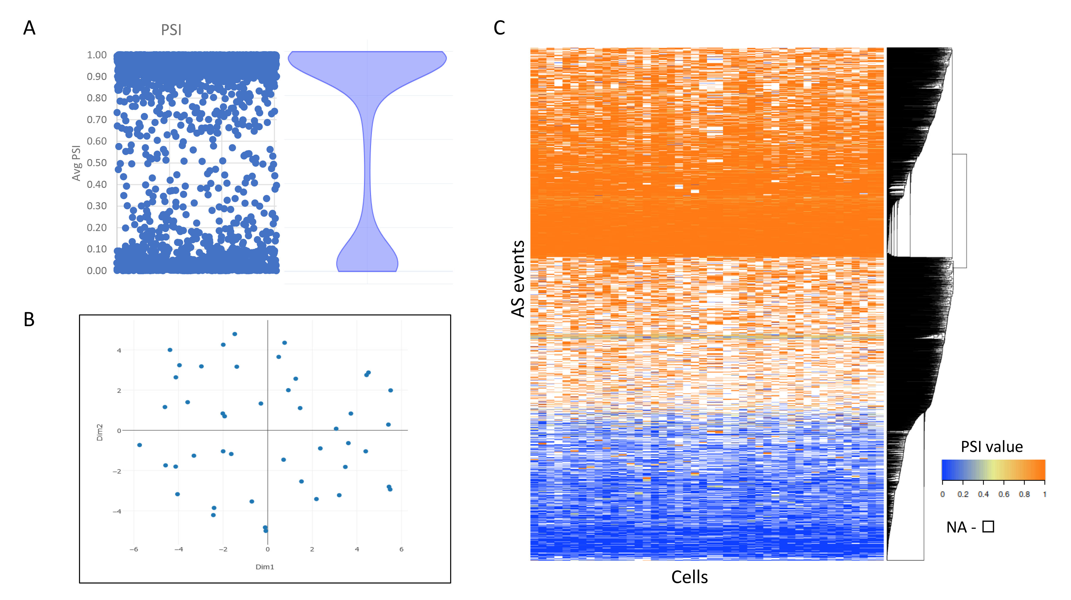
 Figure 5 of
Watson, Mol Vis 2020; 26:766-779.
Figure 5 of
Watson, Mol Vis 2020; 26:766-779.