Figure 2. Quality control plots generated by arrayQualityMetrics before and after removal of CTRL3 and CTRL9. A and B are a false color heatmaps indicating the distances between arrays, computed as the absolute mean distance between the data.
C and D indicate the sum of distances computed for A and B. For C the outlier threshold was 7.14 (vertical bar), and for D the outlier threshold was 5.79 (vertical bar). When analyzing all
18 samples, both CTRL3 and CTRL9 were flagged as exceeding the outlier threshold (A and C). When CTRL3 and CTRL9 were omitted, only ARM7 exceeded the threshold (D). E and F are boxplots of the gene-level signal intensity distribution across the arrays. For E and F, the Kolmogorov-Smirnov statistic Ka was calculated based on the distanced between each individual array and the pooled distribution of all arrays. G and H show Ka for each array with outlier thresholds (vertical bars) of 0.0509 and 0.049, respectively. Only CTRL3 was flagged by this
metric (G).
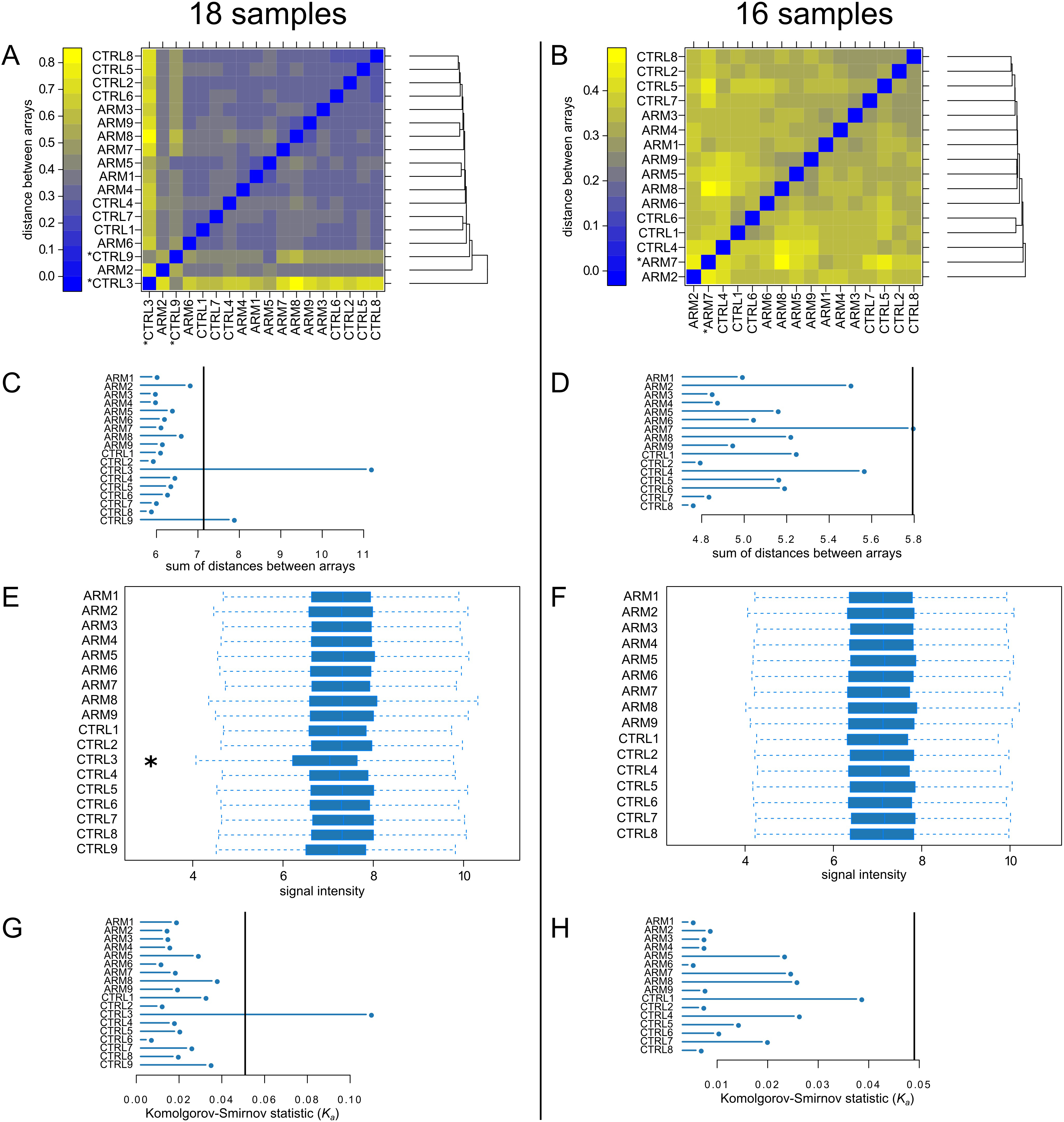
 Figure 2 of
Whitmore, Mol Vis 2013; 19:2274-2297.
Figure 2 of
Whitmore, Mol Vis 2013; 19:2274-2297.