Figure 1. Linkage disequilibrium plot of five SLC1A3 SNPs in 813 study participants. A schematic of SLC1A3 is shown as a black line with black boxes representing the coding region and white boxes representing the untranslated region.
The locations of the genotyped SNPs are indicated by the dotted line. The D’ value corresponding to each SNP pair is expressed
as a percentage and shown within the respective square. Higher D’ values are indicated in brighter red.
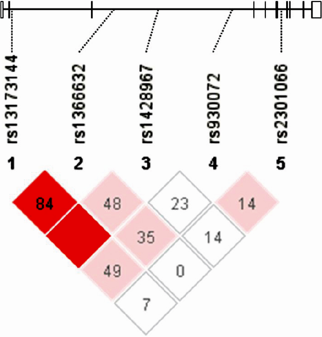
 Figure 1 of
Yasumura, Mol Vis 2011; 17:792-796.
Figure 1 of
Yasumura, Mol Vis 2011; 17:792-796.