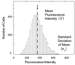
Figure 4. Cytometry population frequency diagram. The
x-axis represents fluorescence intensity, while the
y-axis is the number of cells found at each fluorescence level. The labels denote the mean fluorescence intensity (x¯) and standard deviation of the mean (σx¯) in the figure [
24].
 Figure 4 of
Hjelmeland, Mol Vis 2010; 16:1108-1121.
Figure 4 of
Hjelmeland, Mol Vis 2010; 16:1108-1121.