Figure 3. Correspondence analysis plot. The principal components 1 and 2, which explain the highest amounts of variance in the data
set, are shown on the x- and y-axis of the plot, respectively. The samples are colored according to the dietary groups. The
low-His samples (LLL) are blue, and the medium-His samples (MMM) are dark red. The dark red and blue lines are plotted from
the point of origin through the respective group medians, which are marked by an equally colored dot. The total variance retained
in the plot is 16.349%, the x-axis component variance is 10.623%, and the y-axis component variance is 5.726%.
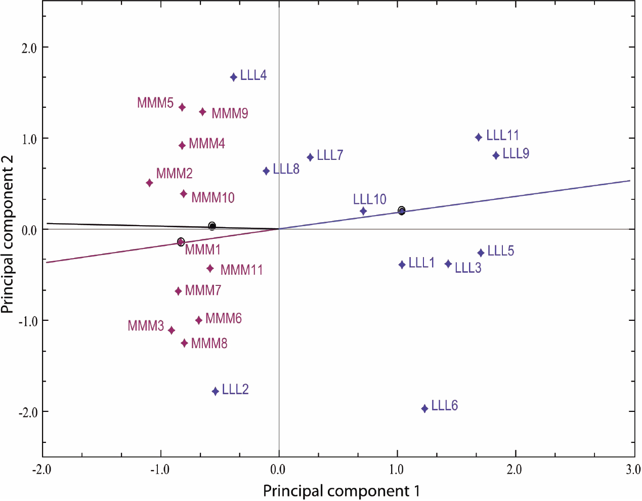
 Figure 3 of
Tröße, Mol Vis 2009; 15:1332-1350.
Figure 3 of
Tröße, Mol Vis 2009; 15:1332-1350.