![]() Figure 3 of
Medvedovic, Mol Vis 2006;
12:422-440.
Figure 3 of
Medvedovic, Mol Vis 2006;
12:422-440.
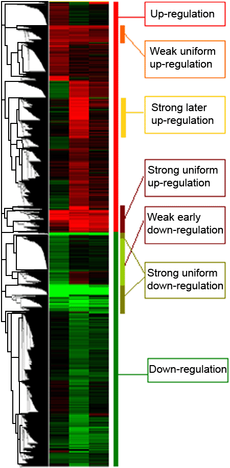
Figure 3.
Heat map from the cluster analysis of 2,094 differentially expressed genes. The hierarchical clustering of all genes with each line representing expression levels for a gene as compared to control and each column a time (1, 2, and 3 weeks post-lentectomy). Shades of red indicate increased expression and the shades of green decrease. Genes are grouped according to a particular expression pattern (i.e., upregulation or downregulation) and within these two groups in other sub-groups, such as strong uniform upregulation, strong uniform downregulation, etc. Five clusters of co-expressed genes outlined in the figure were statistically significantly enriched for genes in at least one GO category.