![]() Figure 6 of
Jablonski, Mol Vis 2004;
10:577-587.
Figure 6 of
Jablonski, Mol Vis 2004;
10:577-587.
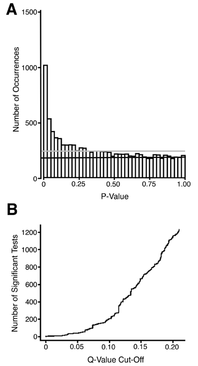
Figure 6. p Value distributions and q value cut-off values
A illustrates a frequency histogram of the p values obtained in the array analysis. The pale grey horizontal line indicates the distribution of p values under the assumption that all tests are truly non-significant. The darker horizontal line indicates the uniform distribution of p values expected in this data set, with 71.7% of the tests truly non-significant. The frequency of tests above this line is the frequency of truly significant results estimated in each p value bin of the histogram. B illustrates the number of rejected tests at a given q value. Note that for a q value of 0.2, 1150 genes are declared significant, and 20% or 230 of these rejected tests are false discoveries.